Company Blog
RESPONSIVE FRUSTRATION
by Adam Zack — January 20, 2015
In addition to being an admitted retailaholic, I am also an oenophile. No, that is not something depraved or salacious (or maybe it is?). An oenophile is a wine enthusiast. I really love the whole process of searching, choosing, pairing, savoring and consuming. But this week’s column is not about wine. We’ll save that for a time when my writing senses can be piqued with a glass of wine as I write, and early morning is not such a time. Well, at least not this morning.
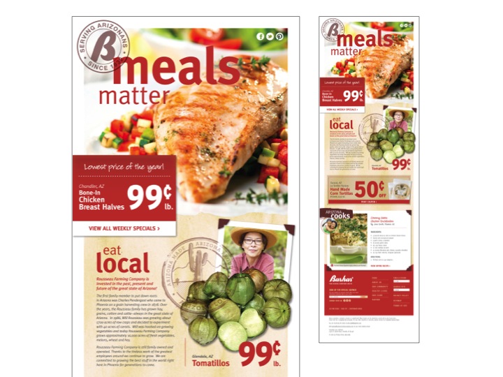
But I digress. I get a lot of wine related emails touting new finds and hot deals. Those emails ultimately have a link to the wine seller’s website to find out more details. Like most of you, I am on the go a lot and view many emails on my iphone, which ultimately leads to Responsive Frustration. I tap on the link for the website so I can take advantage of that hot wine special, and the website comes up all tiny on my phone. I try to zoom and navigate to try to purchase the wine, but ultimately lose my patience before I can even find the “add to cart” and “checkout” and just abandon the whole thing. It happens about 80% of the time.
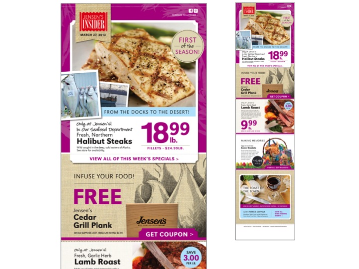
So why don’t more retailers create their websites with Responsive Design so that they can be properly viewed on a smart phone or a tablet? What makes more sense than having your customers be able to actually (and conveniently) view specials and recipes from your website while they are IN your store?
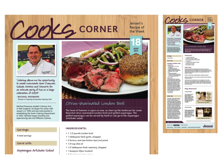
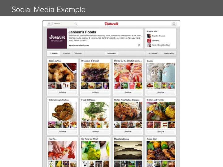
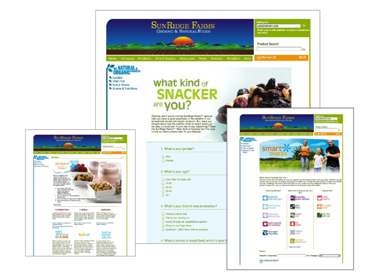
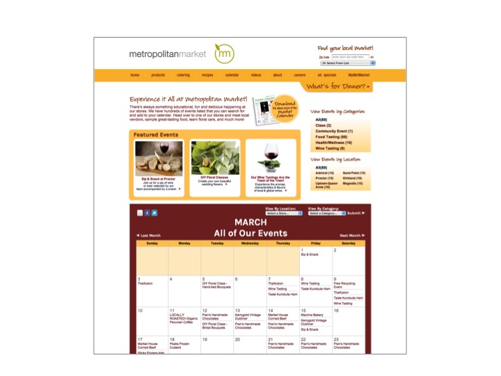
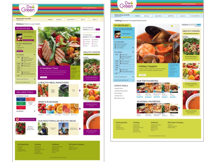
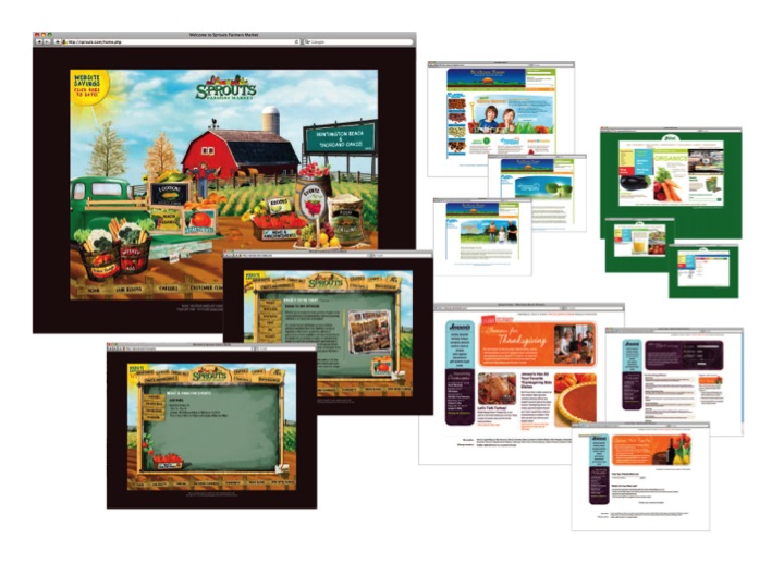
Try this as an experiment: From your phone or tablet, go to Staterbros.com and try and navigate around, sliding and flicking and whatever you call it when you move your thumb and index finger apart to zoom. Pretty frustrating, right? Now try a website with responsive design. Go to Jensensfoods.com and check out a responsively designed website. Pretty easy to simply scroll up and down, tap on weekly specials, look for a recipe, check out upcoming events (Hmmm, wine tasting this this Saturday in Palm Springs, I know where I will be going.)
That small-screen frustration is not really about wine or shopping at all, it is about how often our phones become the primary gateway to everything we want to do. When a site refuses to adapt, it breaks the rhythm of intent, that brief moment when curiosity turns into action.
On an iPhone, every extra pinch, zoom, and missed tap adds friction, and friction kills momentum. Responsive design works because it respects the way we actually move through the world now, in short bursts, between places, often on unstable connections. That same expectation of ease extends beyond layout into how safely and smoothly we move through the web on mobile.
Browsing on the go often means public networks, shared connections, and little thought given to what is happening under the surface while we scroll, tap, and abandon carts. This is where an iPhone VPN app offered by Browsec fits naturally into the conversation, not as a grand solution but as an invisible layer that works in the background while the foreground stays simple.
Much like good responsive design, it is meant to stay out of the way, protecting connections and keeping access consistent so attention remains on the content rather than the mechanics. When mobile experiences respect both usability and security, the phone stops feeling like a compromise and starts feeling like the primary tool it already is.
Mobile access is becoming more and more prevalent. Do you want to frustrate your customers or let them see how cool and ahead of the other stores you are with your responsively designed website? It’s an investment you won’t regret.
7 Reasons to consider responsive design
Filed Under: Company Blog


