Company Blog
Dear Lord, Show Me a Sign!
by Adam Zack — February 18, 2015
sign: noun \ˈsīn\ : a piece of paper, wood, etc., with words or pictures on it that gives information about something
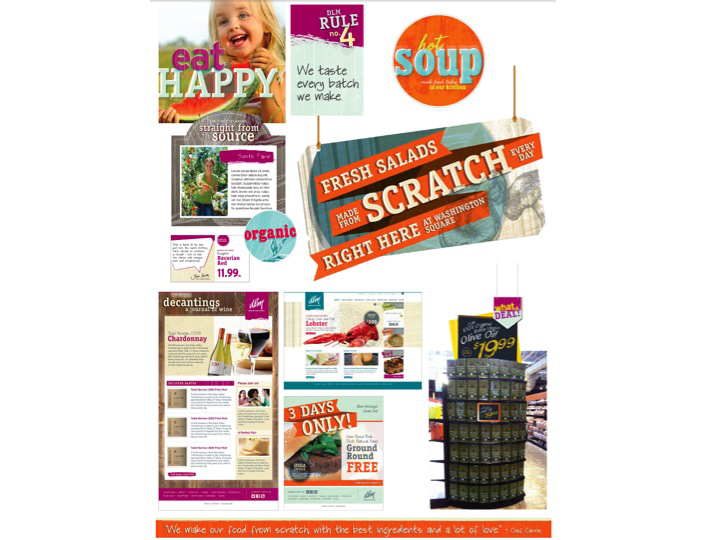
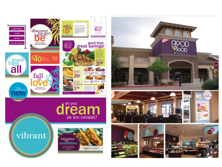
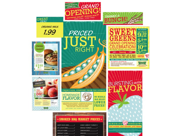
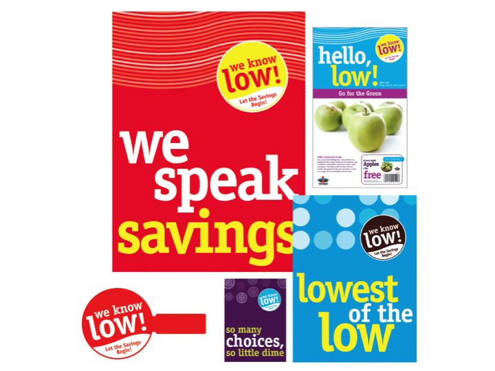
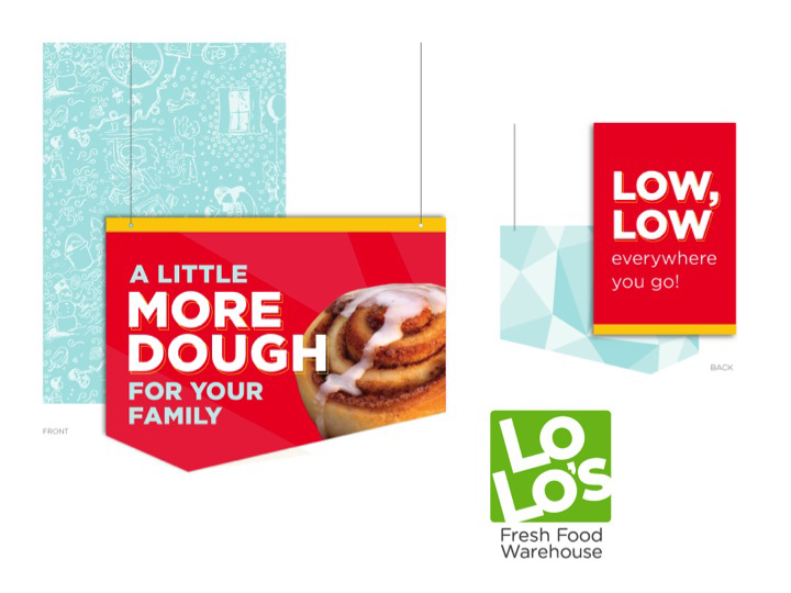
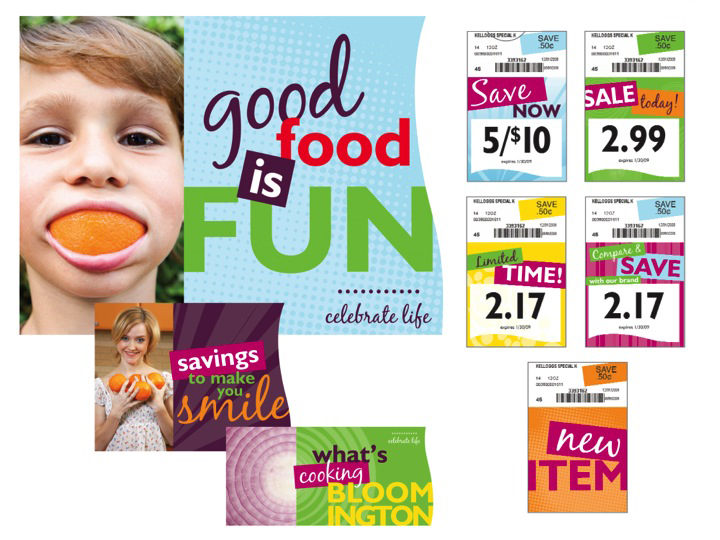
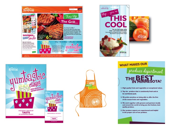
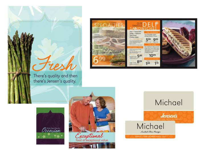
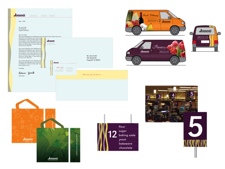
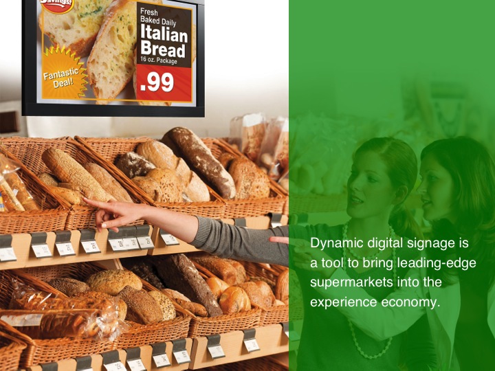
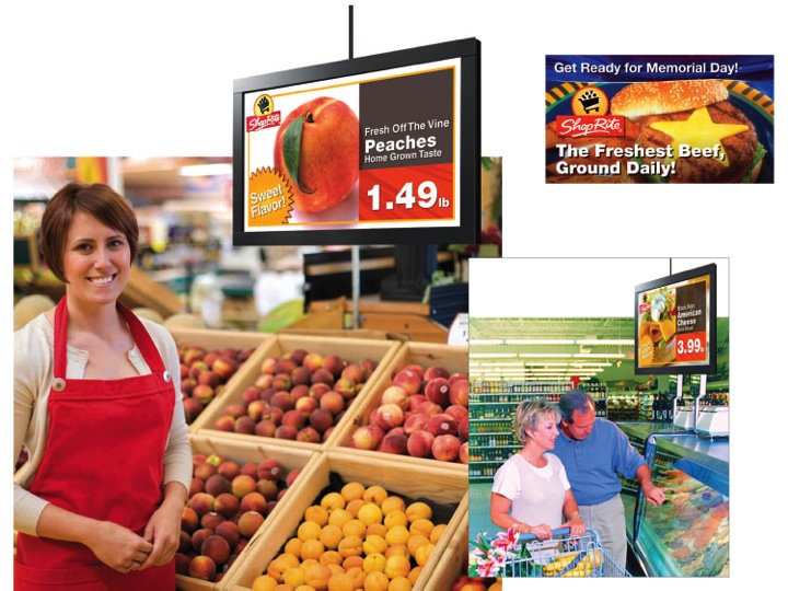
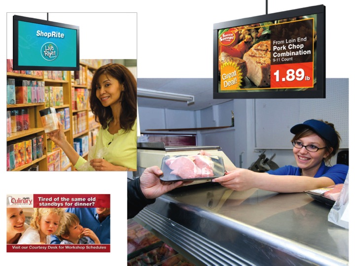
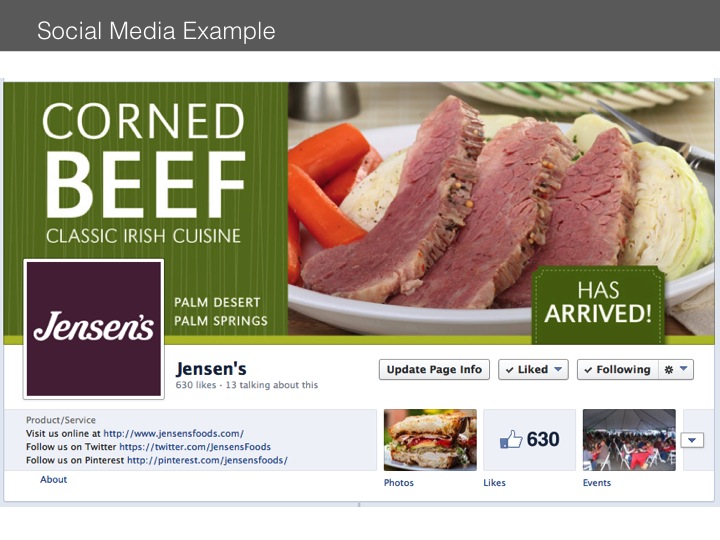
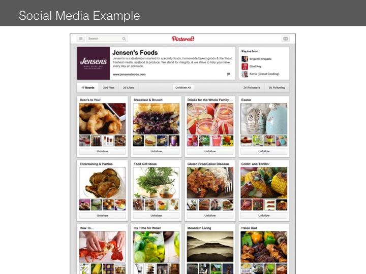
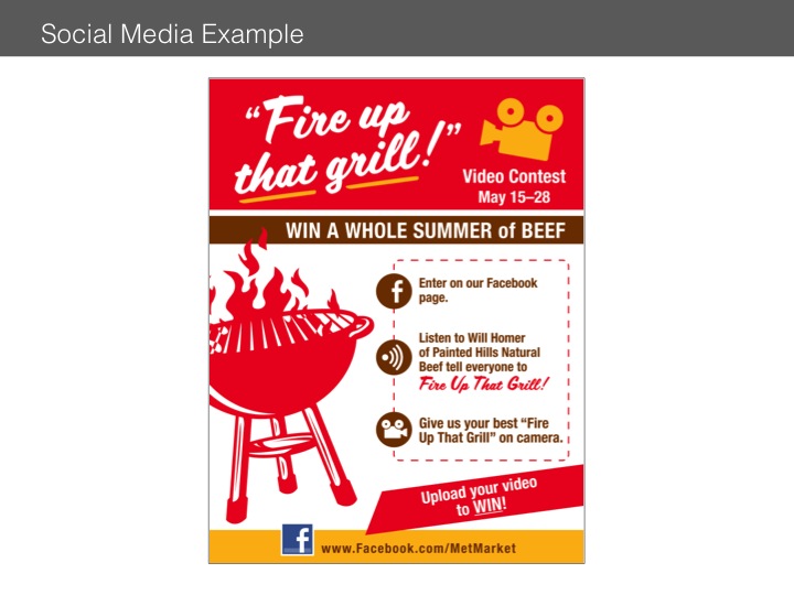
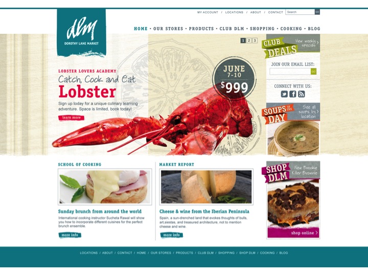
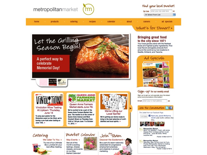
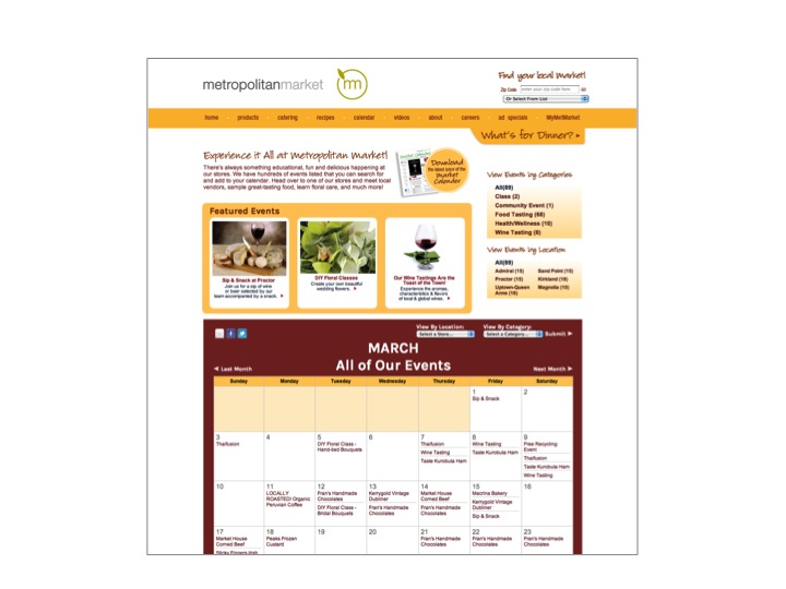
There are a handful of retailers that do signs right. I mean really do in-store signage right. Signs that convey the store’s brand, the item’s purpose for having a sign, the pertinent facts the customer needs to know about the item and the personality to actually persuade the customer to purchase. Stores such as Metropolitan Market in Seattle, Dorothy Lane Market in Ohio, Whole Foods, Trader Joe’s and West Seattle Thriftway are some that really get it when it comes to signage. They invest the resources (and it is a serious commitment – with at least one full-time sign person per store) required to tell their story through their signage. And it works. These retailers are extremely successful.
There is another group of retailers that simply does a horrible job at signage. Displays will have no signs at all. Spelling will be incorrect. Prices will not be clear. There will be nothing at all that would make a shopper stop and take notice of the display. Watermelon may be a great deal at 99 cents each (or is it per pound, not a great deal at all), but when the watermelon looks like a pineapple, you’re more likely to be mocked on the internet than sell one. Cereal for $2.99 might be a smoking deal, but is it? What’s the regular price? No one has bought any, so maybe it’s not such a good deal. It’s inexplicable how a retailer with enough smarts to open a retail store could not be savvy enough to look at the signage details in his store. It’s like baking a cake and then forgetting to put the frosting on.
The vast majority of grocers do a respectable – scratch that, not respectable – let’s say satisfactory job of signage. Their signs are present, have a correct sale price and regular price and spell the items name correctly. You can find these signs in every Kroger, Albertsons and Safeway in America. They are basically a tuna sandwich on white bread. Boring! Who wants to settle for boring? Give me a house roasted beef sandwich on a crispy ciabatta roll with horseradish aioli, thin sliced aged cheddar and arugula over the tuna on white any day. Your customers will respond the same way to your signage.
Noted grocery consultant Harold Lloyd, in his new book “Supermarket Rules! 52 Ways to Achieve Supermarket Success” (Brigantinemedia.com) covers signage in Chapter 12:
“Product signs can be much more than conveyors of basic information such as, “What is this?” and “How much does it cost?” Signs can enlighten the customers about the wonders of the product.
“Include information on your signs that does at least one of the following:
- Tells a story: ‘Made in Florence, Italy, by artisan bakers.’
- Solves a problem: ‘Great for a quick, nutritious snack.’
- Answers a question: ‘Fresh, never frozen.’ Or ‘Limited time only.’”
Bottom line, just like the sign in front of your store identifies you, your inside signage should also be a reflection of you and your purpose. Are you interesting, good looking and informative? Do you want your beautiful customers to stop and take notice of you? Then show them you’re not just “Cearl.”
Filed Under: Company Blog


